For the first question of the evaluation, I produced a director's commentary over the top of my documentary to comment on the different codes and conventions used within my documentary and when and how they are used.
Thursday, 5 January 2012

Evaluation Question 2: How effective is the combination of your main product and ancillary texts?
For the second question, I produced a Powerpoint presentation and converted it using SlideShare.org. Like in the rest of my evaluation, I made note of things that I would've done differently were I to do the project again.
Media Studies Evaluation Question 2
Media Studies Evaluation Question 2
View more presentations from Daniel Orr.
Evaluation Question 3: What have you learned from your audience feedback?
For the third evaluation question I produced a video that compiled a selection of clips of me talking to camera, clips of my brother commenting on my work, images and on-screen font.
Evaluation Question 4: How did you use media technologies in the construction and research, planning and evaluation stages?
For the fourth question I produced a presentation using Prezi. To navigate through the steps that I took throughout the production of my documentary, use the right arrow.
Monday, 19 December 2011
Audience Feedback
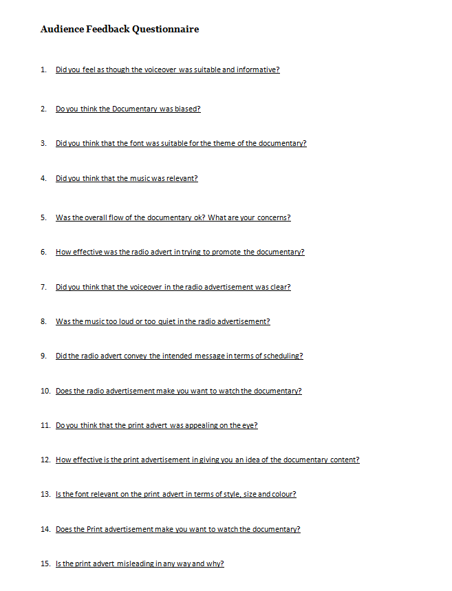
We got people from our target audience to view our documentary and print advert and listen to our radio advert to provide feedback, so that we could assess the success of our work. We produced another questionnaire of fifteen questions; five questions on each of the three arctefacts that we had produced and distributed the questionnaire to people that had seen or heard them to recieve a wide spread of feedback. The audience feedback questionnaire can be seen above.
For the documentary video, people said that the narration was clear and suitable enough, although there were some comments about there being too much narration but otherwise there was not much criticism and people thought that overall the documentary had a good flow with a clear narrative. Our earlier questionnaire had shown that our target audience would've preferred a male narrator to a female one and we took this into consideration when selecting our narrator; something that was praised in our audience feedback. Nobody thought that the documentary was particularly biased and understood that we focused more on takeaways such as Chinese and Indian over ones like Thai and Mexican as they were more popular as seen in our earlier questionnaire results. People thought that the font was clear and relevant and that the music fitted the theme of the documentary.
Feedback on our radio advert was mixed, with most people saying that they could hear and understand the narration but that the music was louder than it in some cases and gave them some difficulties. People said that the radio advert conveyed the desired message of the scheduling and did make them more interested to watch the actual documentary, rendering it a success.
People thought that the print advert was effective, and despite many people saying that it was quite plain that they said the use of a single image was effective and eyecatching and that it made them want to watch the documentary. People said that the font and its colour scheme were relevant, but after some criticsm of our original tagline for being too misleading we changed it to something more suitable.
Tuesday, 13 December 2011
Draft of Print Advertisement
Before we created our final print advertisement, we drew out how we intended it to look on paper. We decided that we were going to have a simple image of a meal in the centre of a plain white page with the Channel 4 logo on the right hand side to go with the style of other Channel 4 print adverts. The font would also be contained within a box of matching colour with the image with the title written above the tagline and the scheduling; also a common feature of Channel 4 print advertisements.

Monday, 12 December 2011
Codes and Conventions of Print Advertisement
Our documentary is intended for Channel 4 and as a result we careful examined the codes and conventions of existing Channel 4 print adverts to make our advert look as professional as possible. All Channel 4 programmes follow the same codes and conventions for their print adverts to create a recognisable and consistant look for the channel. We looked on the Channel 4 website to find some examples of existing print adverts so that we could examine their codes and conventions.


Logo
The Channel 4 is something that is kept consistent throughout all of the channel's print adverts. It is always displayed on the right side in the middle and is never too small so that it is noticeable without being too distracting. The Channel 4 logo is iconic and instantly recognisable and therefore no text is needed to accompany the logo as people would recognise it anyway. The colour of the logo is generally something that would stand out against the background, and if it is coloured it is made to match the rest of the advert; for example, on the above Lost advert the logo is the same colour as the text box. This creates a relationship between the channel and the show and would stick in one's memory as they would think as the two as a pair. Another example of a relationship being created between the channel and the show is seen in the Shameless advert, where the character appears to be stealing the logo. The logo is always displayed in the foreground to make it as clear as possible. These are all things that we will have to consider when putting the logo on our print advertisement.
Image and Colours
The image in the advert either takes up the entire frame - such as in the Lost and This Is England '86 adverts - or is just a single image such as in the Shameless advert. The adverts are generally focused on a key theme featured within the show so to not be misleading or uninteresting to potential viewers that see them. The main image is also generally central and the rule of thirds is applied for key character's eye lines. The images offer as a preview to what can be seen in the show: for example, the Shameless advert implies some sort of theft or crime whereas a crashed plane can be seen in the background of the Lost advert which hints at possible content which could draw people into watching them. The colour and lighting is used to create a mood and atmosphere for the show just off a single image: the Shameless image features mainly darker colours which sets a mysterious and dark mood whilst the character's faces are clearly lit in the This Is England '86 advert which creates relationships between them. The colours are also made so that the logo and font stands out.
Text
Text is kept minimal, only displaying the key information so that somebody looking at the advert can easily find out the vital information without having to scan a lot of text for information which could be off-putting. Generally, the text is contained within a coloured text box in the bottom left corner of the advert where it is clear enough but not distracting from the main image. The colour scheme generally matches the colour of the logo and as a result stands out on the background. Also, only two simple colours are used for the text and the text box to create a clean and simple look. The title of the programme is always at the top of the text box in larger font, with the scheduling and occasionally a tag-line included in smaller font underneath. The positioning of the text box balances out with the position of the logo as it is always on the far left while the logo is always on the far right with the main feature in the centre of the page. Relevant font is also used; most programmes use the official Channel 4 font which creates a consistent and official look to their print advertisements.
We will take all of this into account when producing our print advert as we want it to be professional and realistic as possible.


Logo
The Channel 4 is something that is kept consistent throughout all of the channel's print adverts. It is always displayed on the right side in the middle and is never too small so that it is noticeable without being too distracting. The Channel 4 logo is iconic and instantly recognisable and therefore no text is needed to accompany the logo as people would recognise it anyway. The colour of the logo is generally something that would stand out against the background, and if it is coloured it is made to match the rest of the advert; for example, on the above Lost advert the logo is the same colour as the text box. This creates a relationship between the channel and the show and would stick in one's memory as they would think as the two as a pair. Another example of a relationship being created between the channel and the show is seen in the Shameless advert, where the character appears to be stealing the logo. The logo is always displayed in the foreground to make it as clear as possible. These are all things that we will have to consider when putting the logo on our print advertisement.
Image and Colours
The image in the advert either takes up the entire frame - such as in the Lost and This Is England '86 adverts - or is just a single image such as in the Shameless advert. The adverts are generally focused on a key theme featured within the show so to not be misleading or uninteresting to potential viewers that see them. The main image is also generally central and the rule of thirds is applied for key character's eye lines. The images offer as a preview to what can be seen in the show: for example, the Shameless advert implies some sort of theft or crime whereas a crashed plane can be seen in the background of the Lost advert which hints at possible content which could draw people into watching them. The colour and lighting is used to create a mood and atmosphere for the show just off a single image: the Shameless image features mainly darker colours which sets a mysterious and dark mood whilst the character's faces are clearly lit in the This Is England '86 advert which creates relationships between them. The colours are also made so that the logo and font stands out.
Text
Text is kept minimal, only displaying the key information so that somebody looking at the advert can easily find out the vital information without having to scan a lot of text for information which could be off-putting. Generally, the text is contained within a coloured text box in the bottom left corner of the advert where it is clear enough but not distracting from the main image. The colour scheme generally matches the colour of the logo and as a result stands out on the background. Also, only two simple colours are used for the text and the text box to create a clean and simple look. The title of the programme is always at the top of the text box in larger font, with the scheduling and occasionally a tag-line included in smaller font underneath. The positioning of the text box balances out with the position of the logo as it is always on the far left while the logo is always on the far right with the main feature in the centre of the page. Relevant font is also used; most programmes use the official Channel 4 font which creates a consistent and official look to their print advertisements.
We will take all of this into account when producing our print advert as we want it to be professional and realistic as possible.
Subscribe to:
Posts (Atom)