Monday, 19 December 2011
Audience Feedback
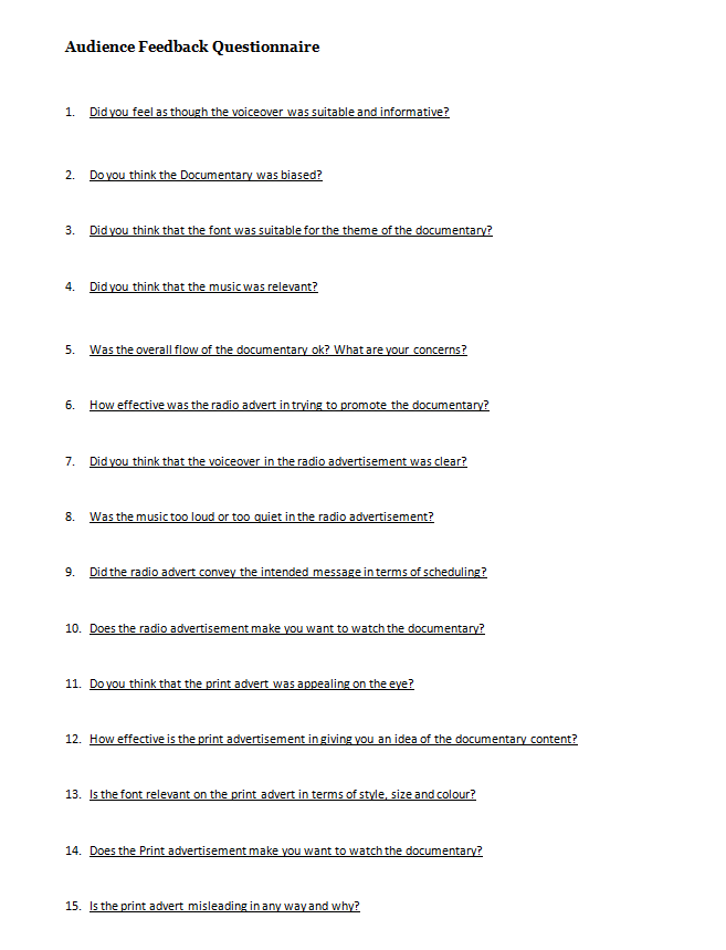
We got people from our target audience to view our documentary and print advert and listen to our radio advert to provide feedback, so that we could assess the success of our work. We produced another questionnaire of fifteen questions; five questions on each of the three arctefacts that we had produced and distributed the questionnaire to people that had seen or heard them to recieve a wide spread of feedback. The audience feedback questionnaire can be seen above.
For the documentary video, people said that the narration was clear and suitable enough, although there were some comments about there being too much narration but otherwise there was not much criticism and people thought that overall the documentary had a good flow with a clear narrative. Our earlier questionnaire had shown that our target audience would've preferred a male narrator to a female one and we took this into consideration when selecting our narrator; something that was praised in our audience feedback. Nobody thought that the documentary was particularly biased and understood that we focused more on takeaways such as Chinese and Indian over ones like Thai and Mexican as they were more popular as seen in our earlier questionnaire results. People thought that the font was clear and relevant and that the music fitted the theme of the documentary.
Feedback on our radio advert was mixed, with most people saying that they could hear and understand the narration but that the music was louder than it in some cases and gave them some difficulties. People said that the radio advert conveyed the desired message of the scheduling and did make them more interested to watch the actual documentary, rendering it a success.
People thought that the print advert was effective, and despite many people saying that it was quite plain that they said the use of a single image was effective and eyecatching and that it made them want to watch the documentary. People said that the font and its colour scheme were relevant, but after some criticsm of our original tagline for being too misleading we changed it to something more suitable.
Tuesday, 13 December 2011
Draft of Print Advertisement
Before we created our final print advertisement, we drew out how we intended it to look on paper. We decided that we were going to have a simple image of a meal in the centre of a plain white page with the Channel 4 logo on the right hand side to go with the style of other Channel 4 print adverts. The font would also be contained within a box of matching colour with the image with the title written above the tagline and the scheduling; also a common feature of Channel 4 print advertisements.
Monday, 12 December 2011
Codes and Conventions of Print Advertisement
Our documentary is intended for Channel 4 and as a result we careful examined the codes and conventions of existing Channel 4 print adverts to make our advert look as professional as possible. All Channel 4 programmes follow the same codes and conventions for their print adverts to create a recognisable and consistant look for the channel. We looked on the Channel 4 website to find some examples of existing print adverts so that we could examine their codes and conventions.
Logo
The Channel 4 is something that is kept consistent throughout all of the channel's print adverts. It is always displayed on the right side in the middle and is never too small so that it is noticeable without being too distracting. The Channel 4 logo is iconic and instantly recognisable and therefore no text is needed to accompany the logo as people would recognise it anyway. The colour of the logo is generally something that would stand out against the background, and if it is coloured it is made to match the rest of the advert; for example, on the above Lost advert the logo is the same colour as the text box. This creates a relationship between the channel and the show and would stick in one's memory as they would think as the two as a pair. Another example of a relationship being created between the channel and the show is seen in the Shameless advert, where the character appears to be stealing the logo. The logo is always displayed in the foreground to make it as clear as possible. These are all things that we will have to consider when putting the logo on our print advertisement.
Image and Colours
The image in the advert either takes up the entire frame - such as in the Lost and This Is England '86 adverts - or is just a single image such as in the Shameless advert. The adverts are generally focused on a key theme featured within the show so to not be misleading or uninteresting to potential viewers that see them. The main image is also generally central and the rule of thirds is applied for key character's eye lines. The images offer as a preview to what can be seen in the show: for example, the Shameless advert implies some sort of theft or crime whereas a crashed plane can be seen in the background of the Lost advert which hints at possible content which could draw people into watching them. The colour and lighting is used to create a mood and atmosphere for the show just off a single image: the Shameless image features mainly darker colours which sets a mysterious and dark mood whilst the character's faces are clearly lit in the This Is England '86 advert which creates relationships between them. The colours are also made so that the logo and font stands out.
Text
Text is kept minimal, only displaying the key information so that somebody looking at the advert can easily find out the vital information without having to scan a lot of text for information which could be off-putting. Generally, the text is contained within a coloured text box in the bottom left corner of the advert where it is clear enough but not distracting from the main image. The colour scheme generally matches the colour of the logo and as a result stands out on the background. Also, only two simple colours are used for the text and the text box to create a clean and simple look. The title of the programme is always at the top of the text box in larger font, with the scheduling and occasionally a tag-line included in smaller font underneath. The positioning of the text box balances out with the position of the logo as it is always on the far left while the logo is always on the far right with the main feature in the centre of the page. Relevant font is also used; most programmes use the official Channel 4 font which creates a consistent and official look to their print advertisements.
We will take all of this into account when producing our print advert as we want it to be professional and realistic as possible.
Wednesday, 7 December 2011
Radio Trailer Script
The radio advert was only to be around thirty seconds in length, but we were still required to produce a script for it for the narrator to read. This script can be viewed below.
Vox Pops - Favourite Takeaway: "Chinese, Indian, Errr... Chinese?"
Voice Over: "We are all familiar with the idea of a takeaway, but what impact is this having on teenagers?"
Interview with Anhar: "Most of our food is freshly cooked by fresh ingrediants."
Voice Over: "And what do adults think about it?"
Interview with Jan: "I'd say that it is acceptable to have a takeaway maybe once a month."
Voice Over: "To find out more, tune in to watch Tasty Takeaways on Thursday at 8pm. Only on Channel 4.
Music Bed: "Weird Al" Yankovic - Eat It
Tuesday, 6 December 2011
Codes and Conventions of Radio Trailers
- The duration is usually between 15 to 60 seconds, with only the necessary information provided in a short amount of time
- Everything is appropriately chosen towards the target audience to make it more appealing to them - things such as previews of interviews are used to make them want to tune in and listen to the entire thing
- The same narrator from the documentary is used for the voice over to create consistency and anchor meaning
- Audio clips are used from within the documentary to show the relationship between the two and to show consistency
- Usually short and simple: Scheduling, Broadcaster and strap line so listeners are able to remember the essential details
- A music bed is used to make the advert memorable for listeners
- The voice over and music used is easy to understand, upbeat and clear so listeners are more likely to be persuaded into watching the program
- The language used is aimed to suit the topic or the target audience
- Generally utilise the key qualities of the product (documentary) to give listeners an incentive to tune in and watch it
Thursday, 1 December 2011
Voice-over Script
Documentary Narration
1. From intro until first interview clip (approx. 7 seconds)
“Takeaways – Britain loves them! These quick and easy meals are a huge hit with teenagers and adults alike as they provide a simple alternative to a normal meal – but what is it that makes them so appealing? “
2. From first interview to first vox pops clip (approx. 8 seconds)
“Takeaway meals are the first choice for thousands when they need a meal in a hurry, and they suit teenagers for their practicality. There are many different types of takeaway heralding from many cultures including Indian and Thai, but what’s the public’s favourite?”
3. From first vox pops clip to interview with Heather (approx. 19 seconds)
“While a takeaway may be a quicker and less time consuming way of getting a meal, cooking your own meal does have many advantages: home cooked meals are much cheaper – we compared a supermarket ready meal to a similar takeaway and found that it was over £5 cheaper with a lower content of unhealthy additives such as fat, sugar and salt. All of this considered, why are takeaways still so popular, especially with teenagers?”
4. From second clip of Janet to second vox pops (approx. 15 seconds)
“The simplicity and convenience of takeaways would appear to be the most justifiable reason for people ordering them, with takeaways seemingly being a lazy excuse due to factors such as cost and health. This considered, do teens prefer to order takeaways over cooking their own meals?”
5. From vox pops to next clip of Heather (approx. 6 seconds)
“So do the youth of today really not consider the financial and diet issues associated with takeaways when they order one?”
6. From clip of Heather to Just Eat advert (approx. 5 seconds)
“Takeaways are becoming increasingly easier to order in the modern day, with takeaway websites such as JustEat.com allowing people to order a takeaway online in just a few clicks.”
7. From Just Eat advert to first clip of Anhar (approx. 2 seconds)
“It’s not just the simplicity that attracts thousands either – many takeaways offer special deals.”
8. From clip of Anhar to next vox pops (approx. 5 seconds)
“So despite their flaws, takeaway meals also have many advantages that make them so popular to so many people – but how frequently do they have a takeaway?”
9. From next clip of Janet to next clip of Anhar (approx. 9 seconds)
“Takeaways are now a main feature of modern society, providing meals and jobs for millions worldwide. We caught up with Anhar Miah, owner of The Raj restaurant, to get an insight onto working in the industry as well as his opinions on takeaways.”
10. In between Anhar interview (approx. 7 seconds)
“Keeping customer service good is certainly a key part of the takeaway business, to keep customers coming back for more. We also asked Anhar about The Raj’s most popular meals, and how they promote their business.”
11. From Anhar interview to Burger King advert (approx. 4 seconds)
“The promotion of takeaway meals is an important part of the industry, with mainstream restaurants such as McDonald’s and Pizza Hut relying heavily on advertisement – bus does this sort of promotion attract the public?”
12. Over Burger King advert (approx. 4 seconds)
“Takeaway companies want advertisement to play a pivotal role in the decision to buy takeaway, with restaurants advertising new meals and special offers to encourage people to shop there”.
13. From Burger King advert to ending montage (approx. 5 seconds)
“The vast variation of the takeaway industry is what keeps people coming back for more – there are so many different types of meal with a variety of ways to get them.”
Wednesday, 30 November 2011
Editing Diary
I also kept track of my group's progress during the editing process.
- We began by creating a project on professional video software Adobe Premiere Pro called 'Takeaways'.
- We then captured all of the footage from the tape and arranged them on the timeline.
- We then gave the clips titles so that we would be able to identify them at a glance.
- We watched each clip and chose which was the best take for each one based off the sound and image quality.
- Once we had chosen the best take we edited them down, cutting any un-needed footage off the start and end of the clips and made a note of the timings on our edit decision list.
- After every shot was picked and named we arranged them into a rough cut on the timeline in order.
- We then added graphics for the opening titles and also titles for people when they are introduced.
- We arranged the cutaways in a logical manner so that they were to be placed around a clip that they related to.
- We found that we had an issue that we were running low on clips for use as cutaways. As a result, we decided to use archive footage by downloading footage from the internet of things such as television adverts.
- We then edited these clips and placed them appropriately on the timeline.
- We also removed some of the less satisfactory cutaways and replaced them with archive footage when it was deemed more relevant.
- We began editing the sound, still on Adobe Premiere Pro, once we were satisfied enough with the actual video.
- We changed the sound levels for interviews to remove background sound and to make the speaker as clear as possible. We also removed any sound from shots like cutaways as it would not be needed and helped clean up the timeline.
- We found a song to use for the music bed "Eat It" by 'Weird Al' Jankovic and inserted it into the documentary, fading it in and out when needed (for example, we faded it out completely during interviews) and sometimes creating a loop with the riff to go underneath some clips.
- We made sure that sound transitions were smooth and edited the opening sequence so that the images synchronised with the drum beat as a match on action.
- Once we felt that our documentary was almost finished, we scripted the narration and uploaded it to our blogs.
- We recorded the voice-over and inserted it into the designated spaces that we had reserved on the timeline for it. In some cases the speech had to be edited or parts had to be removed so that it would fit in properly.
- We checked through the documentary and got other's feedback. We made a few last changes to the sound and rearranged a few clips before exporting the video as an AVI file.
Blue screen editing was done in Adobe Premiere Pro, using the 'chroma key' tool in the 'video effects'.
We had a problem with having too much on the timeline at once - if I were to do this again I would be sure to keep all the clips and footage more carefully organised.
All of our documentary editing was done on Adobe Premier Pro, including the sound.
We planned in advance for the inclusion of the narration by leaving spaces on the timeline in the audio.
During the editing process I was sure to keep my editing diary up to date along with other documents such as the edit decision list being included on my blog.
Tuesday, 29 November 2011
Edit Decision List
Using our logging sheets, we were able to go through our footage and decide how and what was going to be edited. We went through our footage and made notes of where about in the footage the different clips were and made notes of them on the edit decision list so that we would be able to find and edit them efficiently.
Saturday, 19 November 2011
Copyright Issues
Emails that were sent to recieve Copyright permission:
To Whom It May Concern,
I am writing to you to request copyright permission for our student documentary which we would like to include short segment of Eat It - "Weird Al" Yankovic, this video will only be shown to the exam board and will not gain any financial profit. Thank you.
A2 Media Students at Priestley College; Sophie Riley, Daniel Orr, Robert Young and Samuel Taylor
To Whom It May Concern,
I am writing to you to request copyright permission for our student documentary which we would like to include short segment of a Just Eat advertisment, this video will only be shown to the exam board and will not gain any financial profit. Thank you.
A2 Media Students at Priestley College; Sophie Riley, Daniel Orr, Robert Young and Samuel Taylor
To Whom It May Concern,
I am writing to you to request copyright permission for our student documentary which we would like to include short segment of a Burger King advertisment, this video will only be shown to the exam board and will not gain any financial profit. Thank you.
A2 Media Students at Priestley College; Sophie Riley, Daniel Orr, Robert Young and Samuel Taylor
To Whom It May Concern,
I am writing to you to request copyright permission for our student documentary which we would like to include short segment of Eat It - "Weird Al" Yankovic, this video will only be shown to the exam board and will not gain any financial profit. Thank you.
A2 Media Students at Priestley College; Sophie Riley, Daniel Orr, Robert Young and Samuel Taylor
To Whom It May Concern,
I am writing to you to request copyright permission for our student documentary which we would like to include short segment of a Just Eat advertisment, this video will only be shown to the exam board and will not gain any financial profit. Thank you.
A2 Media Students at Priestley College; Sophie Riley, Daniel Orr, Robert Young and Samuel Taylor
To Whom It May Concern,
I am writing to you to request copyright permission for our student documentary which we would like to include short segment of a Burger King advertisment, this video will only be shown to the exam board and will not gain any financial profit. Thank you.
A2 Media Students at Priestley College; Sophie Riley, Daniel Orr, Robert Young and Samuel Taylor
Wednesday, 2 November 2011
Logging Sheets
We logged all of our footage and filled out the logging sheets in order to make note of where about in the footage each clip was so that we would be able to find it easily, what was contained in the clip, how long it was and whether it was a good take or not. This allowed us to keep track of all of the footage that we had shot with a reminder of what the shot was like, and allowed us to easily see whether the shot was worth using or not.
Tuesday, 18 October 2011
Filming Diary
In order to keep track of what we were filming and when, we decided to make a filming diary that we would fill in every time that we filmed something. This way, we would be able to document each filming session which would allow us to make note of exactly what was done and whether it was done well or not; with reasons. We also occasionally took photos when filming.
Tuesday, 18th October
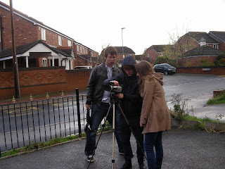
Our first day of filming was in Culcheth, a large village in Warrington. We decided that this was a suitable place to film as there are many takeaway restaurants located nearby to each other, which would make tasks such as filming restaurants for cutaway shots easy, quick, and practical. Furthermore, two of our group members live in Culcheth and therefore had links with people working in local takeaway restaurants as well as a general knowledge of the area: this would allow us to make the best use of our time by filming a lot of varied footage in a short time without wasting time. We met at around midday as we wanted to get our outdoor filming done in daylight whilst not having too much time to spare afterwards, as we were aware that we could not order a takeaway to film until 5:30pm. Unfortunately the weather for mainly rainy on this day, which had a negative impact on some shots as well as when and where we could film due to us not being able to put any electrical equipment out in the rain. We did bring an umbrella to help shield the camera when possible but it was still not ideal.
Monday, 17 October 2011
Location Sheets
We created two location sheets that depict two different settings with information alongside them, making note of any potential danger hazards and the address for reference. The first sheet portrays the location of the ground floor of a member of our group's house so when we come to film the group will acknowledge their surroundings and be able to adapt to them, as well as being aware of any potential hazards. The second sheet is split into two different sections; the front of The Raj (a local Indian takeaway/restaurant located in the village of Culcheth) and then a bird's eye view of it including the indoors. This assures my group and I that we will be able to prepare ourselves and work when we arrive and begin filming in the environment of the takeaway. The two documents also give details for the two locations such as the Address, and Health and Safety issues and the Date that we would film at the specific location. This helps us to plan and determine any considerations of the process of filming at the locations before we begin the practical production.
Interview Questions
We decided on a number of questions that we could potentially ask our Interviewees for use in our documentary - we will ask them to a number of people including the public, parents of teenagers/students (our target audience), and workers in takeaway restaurants. We specifically chose to highlight upon certain aspects of takeaways such as comparing it to home cooking, the cost, the time of having one and the service received from takeaways. We aim to ask these questions to get honest responses from the general public and for us to make unbiased points within our documentary to communicate to our viewers. The interviews will be shown in the documentary to back up the observations and the balanced exposition.
- Do you prefer getting a takeaway to cooking your own meal?
- Is there something that you frequently order from a takeaway?
- Do you think about eating healithy when you order a takeaway meal?
- Do you find takeaways too expensive?
- Is there a type of takeaway that you never order food from?
- Do some takeaways take too long to be delievered?
- Do you ever use the vouchers and discounts that some takeaways offer?
- Do adverts on television ever convince you to buy takeaway?
- Would you order healthy meals from a takeaway if you were given the option?
- Is 5-a-day something that you try and stick to?
- Are the drinks from takeaways usually good value for money?
- Would you prefer less sauce with your takeaway meal?
- Do you like spicy food?
- Do you like ordering deserts from takeaways?
- When do you choose to have a takeaway?
- Do you like to order takeaways from the same company each time?
- Do you recieve takeaway menus through the post?
- Do you collect takeaway menus?
- Are you always satisfied with the overall service you recieve from takeaways?
- Do the locations of takeaways ever influence your decisions in ordering them?
Storyboarded Single Frames
So that we could go into more detail that the amount used on the storyboards for certain interviews, we created single frame close ups of certain panels from the storyboard to give us a more realistic insight and guidance into our initial plans of things such as the mise-en-scéne of the shot and the surroundings of the interviewee: we would be able to refer back to these sheets when doing our interviews in order to check that everything and everyone would be in their right place.
The first single frame depicts an employee being interviewed at the local takeaway, The Village Pizza. We decided that the interview with a takeaway employee should take place either outside or in a takeaway restaurant, depending on availability, times, and lighting conditions among other things.
The second frame is of a parents who is being interviewed in her comfort zone of her house - namely the kitchen/dining room, as this would also provide relevant mise-en-scéne.
Storyboards of opening sequence
We storyboarded the opening five minutes of our documentary - the footage that we would be producing. Interviews were not required to be completely storyboarded here a they would take up much space with many similar shots, so interviews and vox pops are just represented by a single frame on the storyboard. We would be able to use this storyboard as a guide when we were filming and producing our documentary as it outlines what each shot should look like and include, as well as laying out the order for the narrative of our documentary opening.
Running Order
We produced a running order for our documentary so that we would be able to map out exactly how our documentary would pan out in terms of timings and how and when certain aspects that we wanted to include in our documentary would be incorperated. Even though we would only actually be producing the opening five minutes of our documentary (marked onto the running order below), we also included the rest of the documentary on our running order - how it would be set out if we were indeed required to produce it. We also included where the advert break would be and made sure that the total time was added up correctly to make our production seem more professional and realistic.
Wednesday, 12 October 2011
Research
Here are screen shots and links to external sources from our research that will aid us in the production of our documentary. By doing this we will easily be able to access and compare all of our external sources, as well as refer back to sources of information should we; for example; require to return to a certain source such as a website to check something or retrieve more information. We will also be able to note each source's usefulness and reliability, which could influence future decisions on where we do and don't get information and data from.
Subscribe to:
Posts (Atom)